
Client website
Hussarian Solutions Group
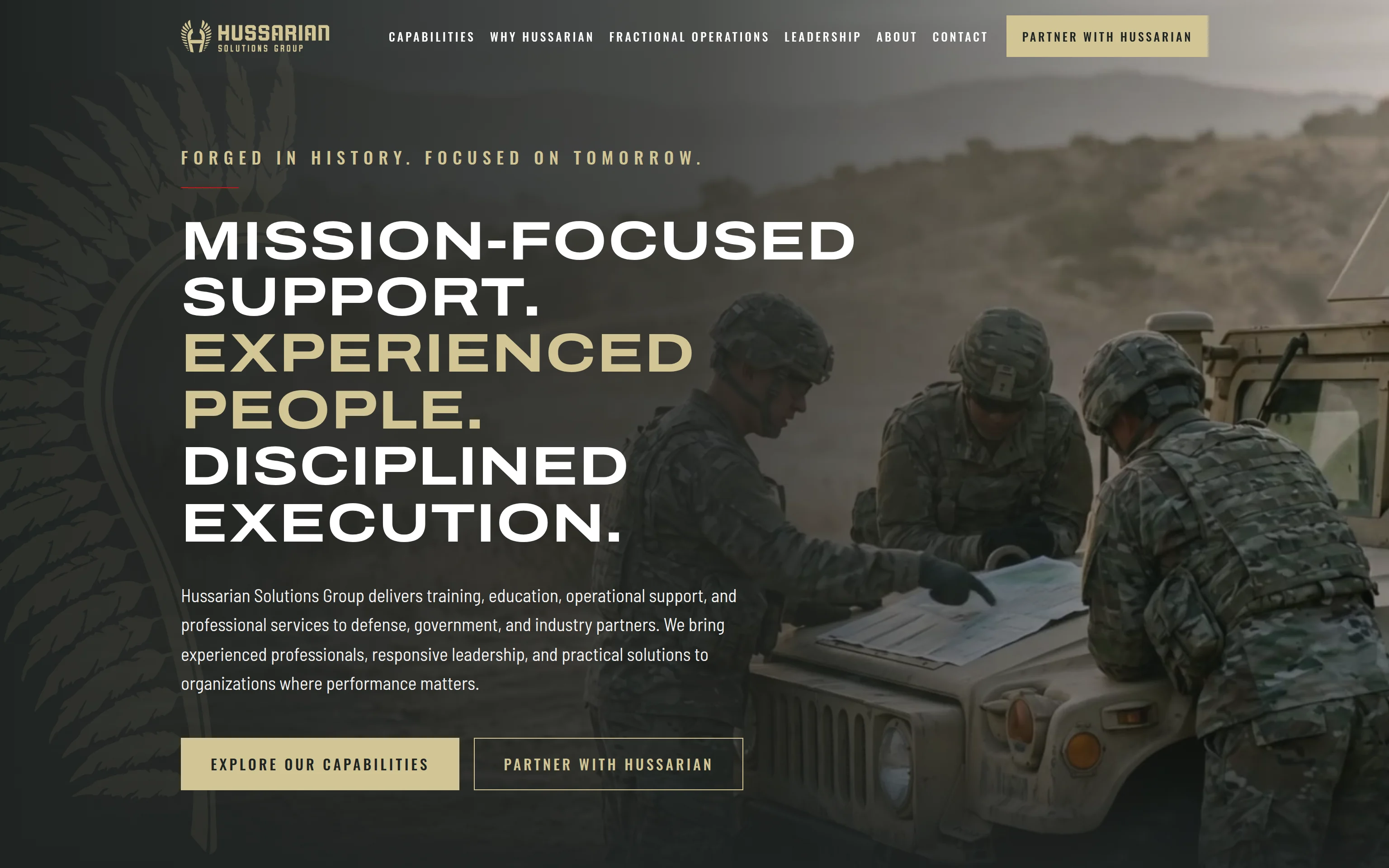
The launch website for Hussarian Solutions Group, a small business supporting defense, government and industry partners — one page built like the operational documents its readers trust, with one inquiry form that routes four kinds of conversation.
- What it is
- Client website
- Whose
- Client project
- Status
- Launching at hussarian.com
See it working.
Overview
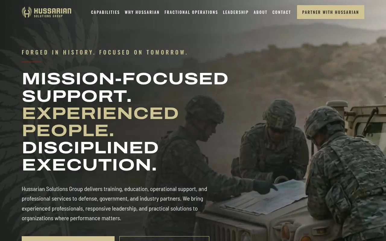
Hussarian Solutions Group provides training, education, operational support and professional services to defense, government and industry partners, and fractional operations leadership to growing government contractors. Vahzor designed and built its launch website: one page, a privacy page, a branded not-found page, and the inquiry form behind every call to action.
The problem
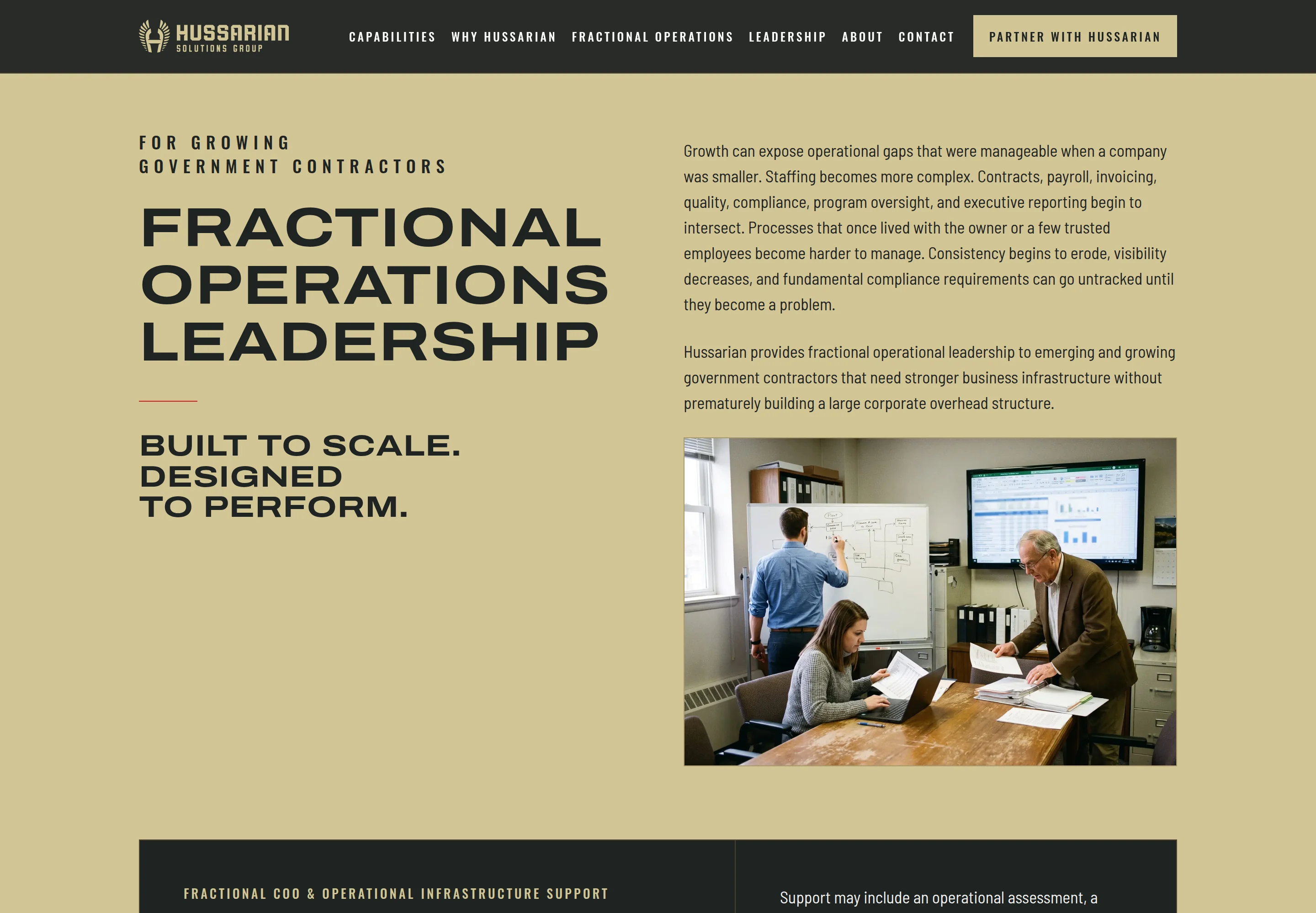
The site has two readers who want different things, and they had to be served in order. A prime contractor or a government buyer needs to see the federal capability first, plainly, with the identifiers they look for. An owner of a growing contractor needs to find a commercial offer — fractional operations leadership — without it reading as a federal service or as a different company.
Both readers are wary of the defense-website template: crosshairs, camouflage textures, red aggression, superlatives. The brief asked for the opposite — the restraint of the documents these readers already trust — and for nothing to be claimed that could not be verified.
The solution
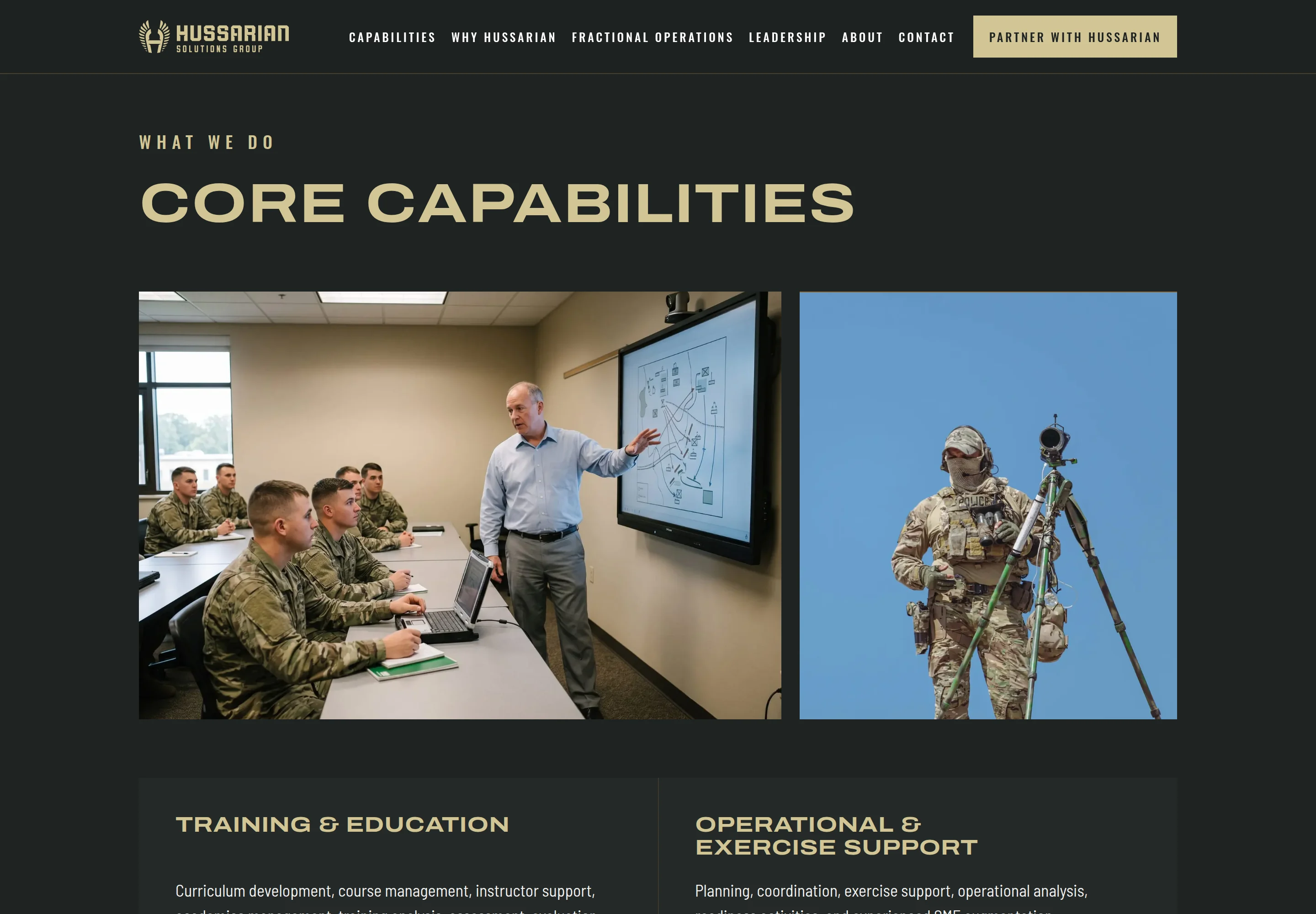
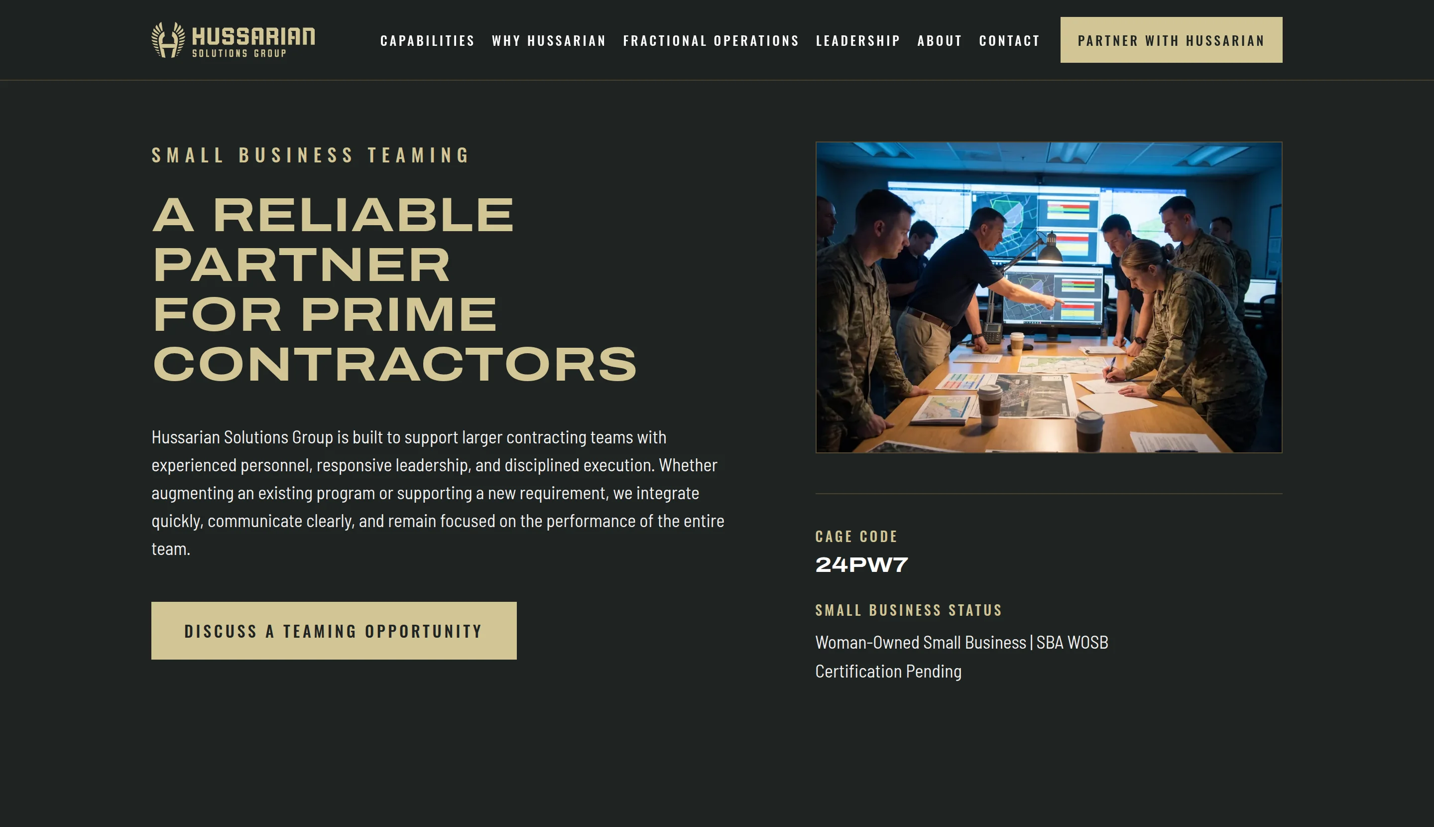
One page in the brief's order: hero, who is supported, four capabilities, why Hussarian, small-business teaming, then the fractional operations section, leadership, about, and the form. The federal identity is established before the commercial offer appears, and the offer is set apart by the field it sits on — the brand's sand with a charcoal panel — rather than by a new colour or a second type system.
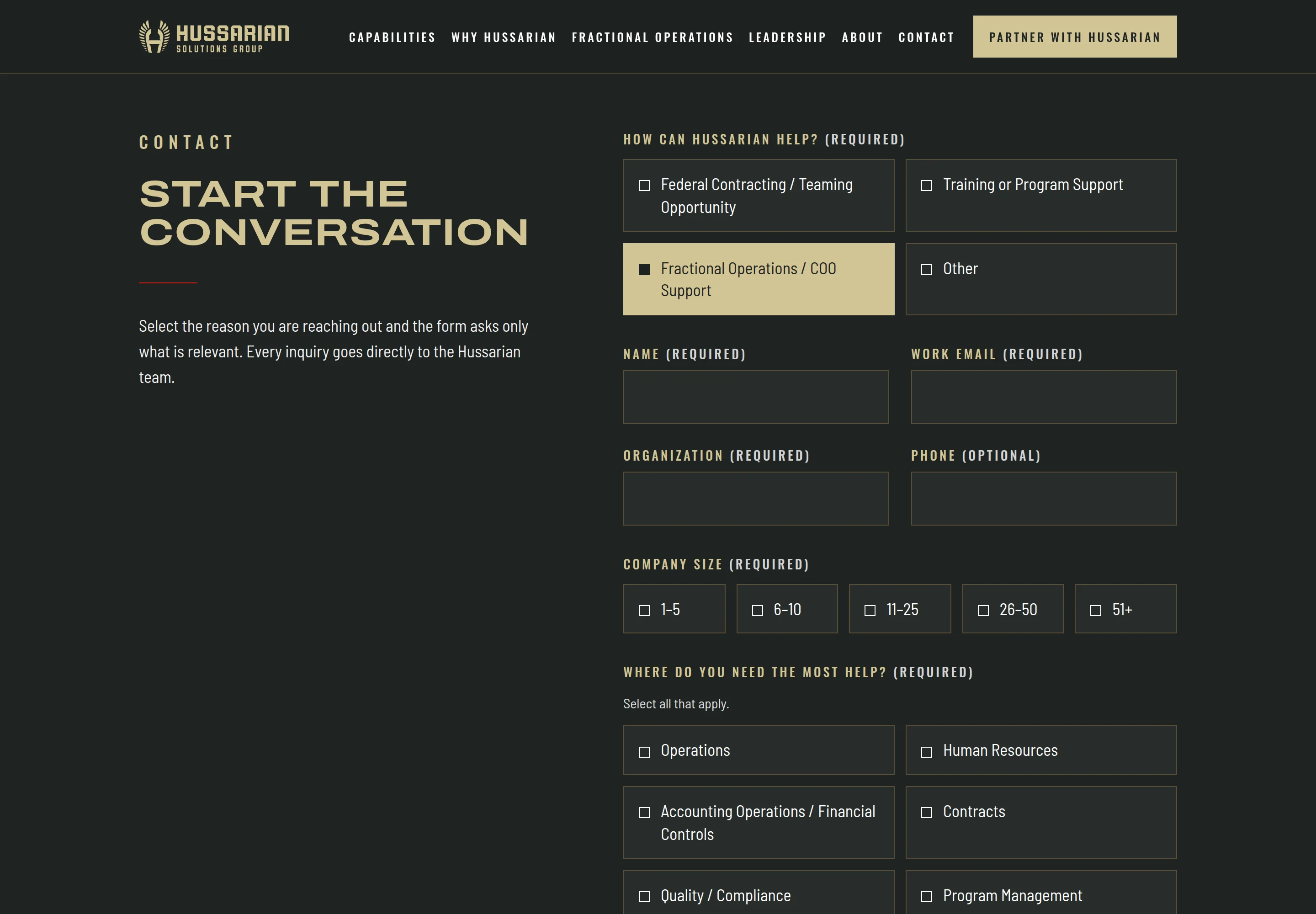
One inquiry form serves every section. Its first question routes the rest: a teaming inquiry and a training inquiry see the opportunity prompt and a sensitive-information notice; a fractional inquiry sees company size, areas of need, the business problem and a preferred contact method; and every call to action on the page arrives with its path already selected. Submissions are validated on the server, rate-limited, and delivered by email — nothing is stored.
The design follows the brand guideline as a rule, not a mood: five colours and no others, three typographic roles, square corners, flat surfaces, gold only as a hairline and red held under five percent of any screen. Unverified contracting claims are not on the page at all; the small-business designation is published exactly as its status reads.
Screens

Technical notes
- Next.js 16 with the App Router, TypeScript in strict mode, and Tailwind CSS v4 with the brand's tokens as the theme; every route is prerendered.
- The form posts to a single server route that applies the same validation as the client, drops honeypot submissions, rate-limits by address, escapes every field, and sends through Resend with the inquiry type in the subject line.
- A Content-Security-Policy that allows only same-origin assets, plus the standard security headers, on every response; the whole site stays noindex until an environment flag is set on the approved production deployment.
- All copy, contact data, navigation, form options and metadata live in one typed content file; fields that are not yet verified for publication are null and render nothing, so the layout adapts rather than showing a placeholder.
Have a similar project?
Describe what you are trying to build or improve, and Vahzor will help define a practical path to it.
Next: JJ Rabbit Creative