
Client website
Selethium
A company website for a service-disabled veteran-owned small business in government and defense, built to read like the record it describes — credentials presented as data, capabilities as a ruled ledger.
Overview
Selethium Inc. is a service-disabled veteran-owned small business providing command and control support to government and defense customers. It needed a company website that would stand up to the way that audience reads: credentials first, claims second, and nothing that cannot be checked.
The problem
A new company in this market is assessed before it is read. A contracting officer or a prime looking at a potential teaming partner wants ownership status, a unique entity identifier, a location and a track record — and wants them in the first few seconds, not three scrolls into a narrative.
Most small professional-services sites bury those facts in an about page and lead with a stock photograph and a sentence about excellence. That is the opposite of the order this audience uses, and it makes a credible company look like every other one.
The solution
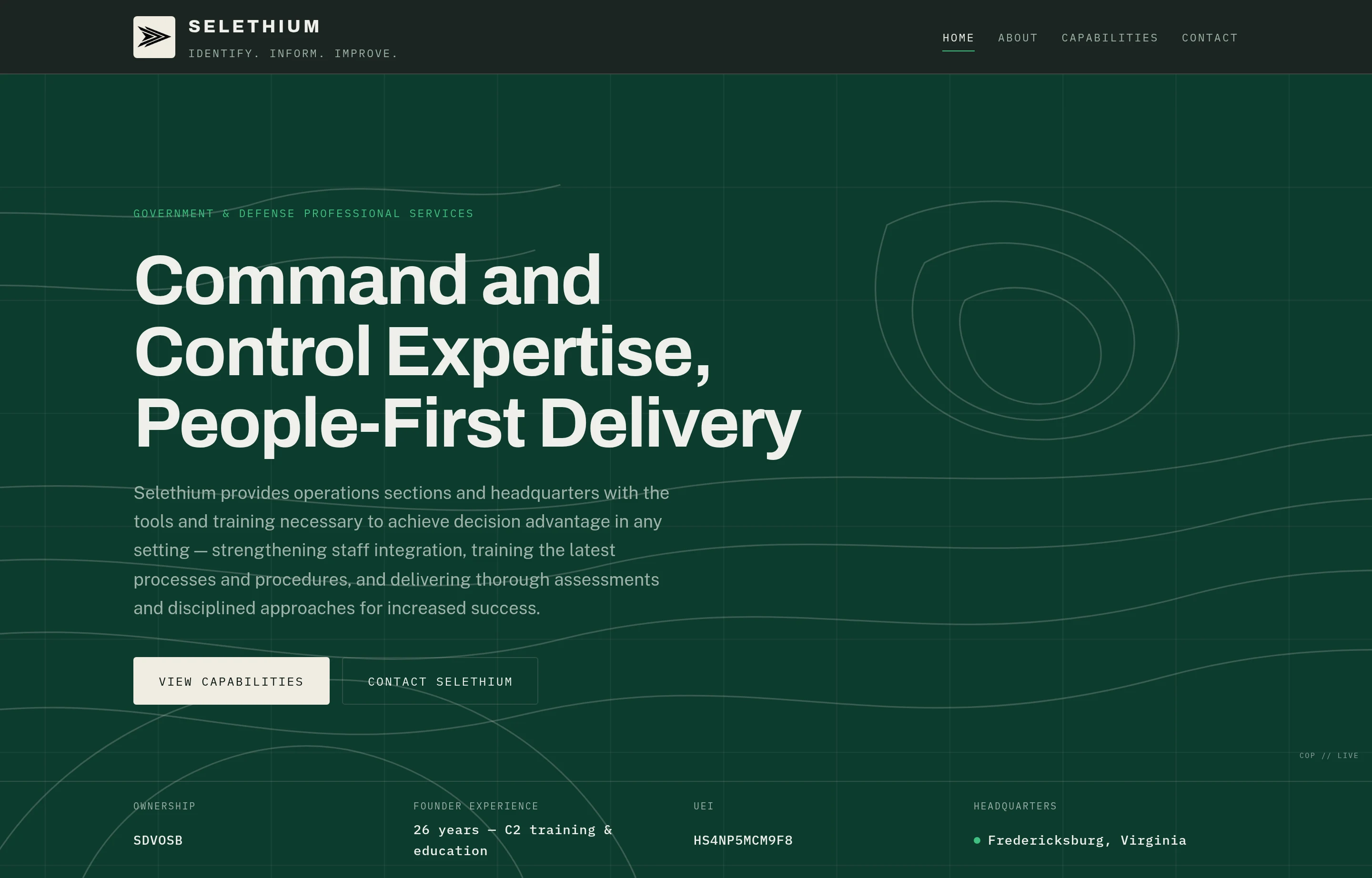
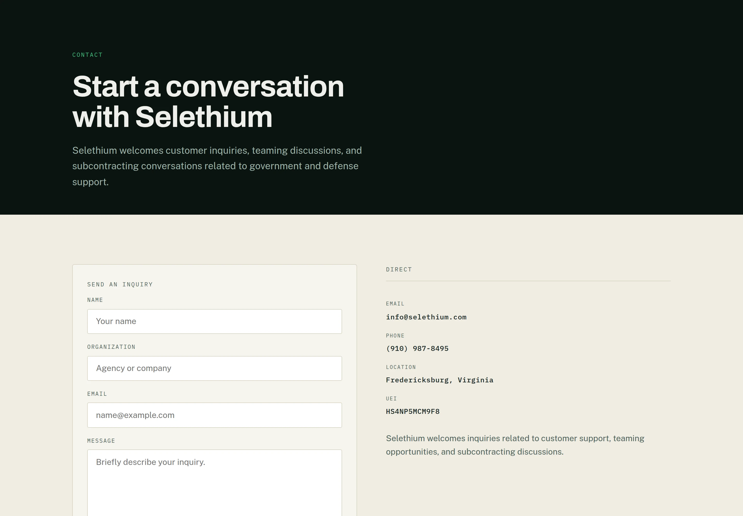
The site leads with the facts as a record. Under the hero, a mono strip states ownership, founder experience, UEI and headquarters in the register federal data is usually presented in — the same treatment used again on the contact page, so the identifiers read as one consistent record rather than scattered claims.
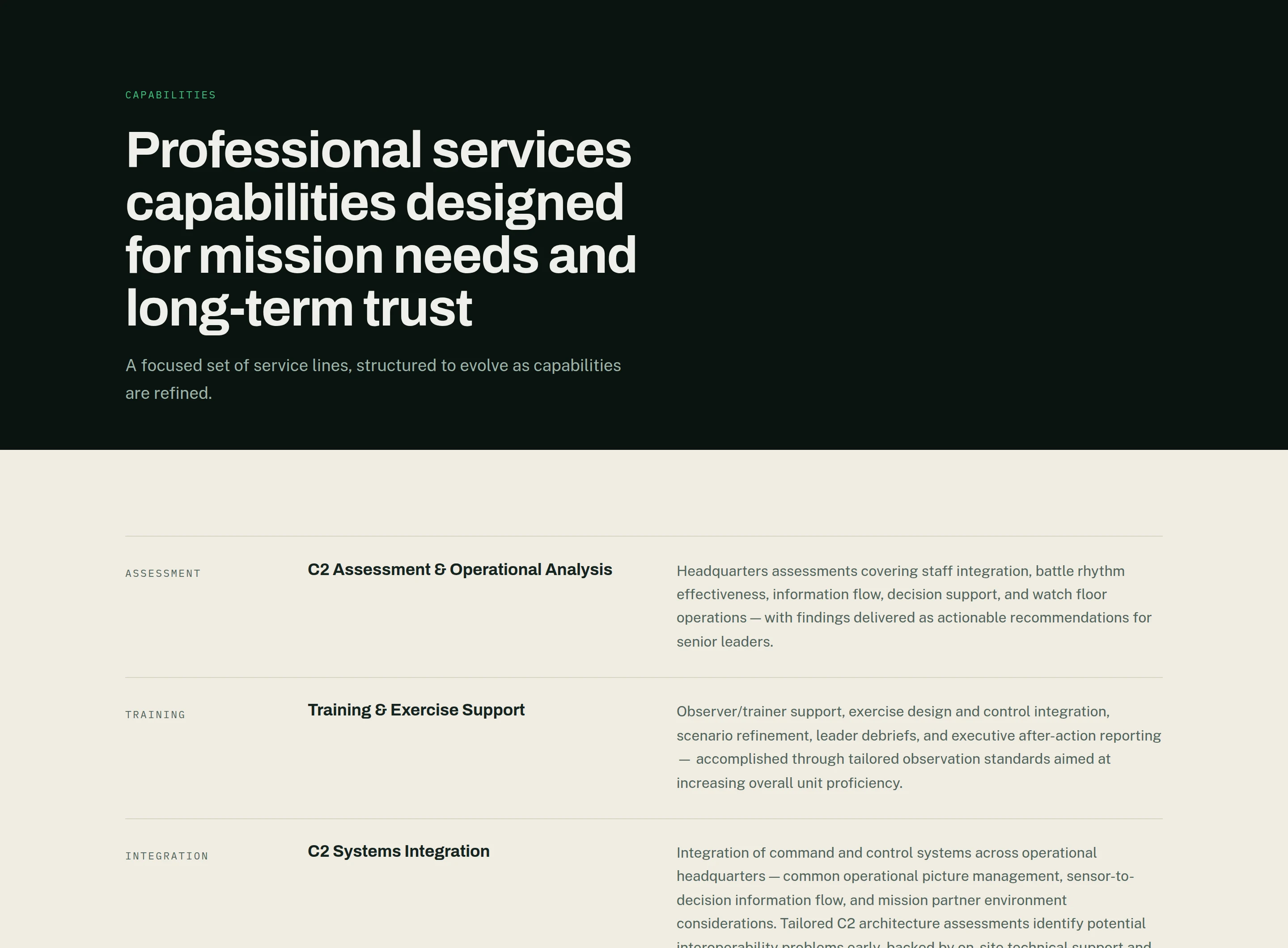
Capabilities are a ruled ledger rather than a grid of cards: six rows, each a mono tag, a title, and a paragraph of what the work covers. Rows are read down; tiles invite comparison across, which is the wrong gesture for six things a customer may need any one of.
The visual system is built from the audience rather than from taste. Public Sans is the typeface of the U.S. federal design system; the palette is a near-black evergreen with a bone counter-band, and the hero carries a drawn terrain field with command-and-control track symbols rather than a photograph.
Everything the company will want to change lives in one content file — copy, navigation, capability areas, and the contract and vehicle listings. The contracts page is fully built and renders an honest empty state, with its nav entry commented out until there are awards to publish: the structure is ready ahead of the content, and nothing on the site implies work that does not yet exist.
Screens
Technical notes
- Next.js 15 App Router with React 19 and TypeScript, and no runtime dependencies beyond React itself. Every route is statically prerendered.
- The three typefaces are loaded through next/font and self-hosted at build, so the shipped site makes no third-party font request.
- The sitemap and robots.txt are generated from the same content module the pages read, so a new page cannot be published and left out of either.
- The terrain hero and the registry strip are components rather than images, which keeps them sharp at any width and editable as data.
Have a similar project?
Describe what you are trying to build or improve, and Vahzor will help define a practical path to it.
Discuss a ProjectWhat Vahzor builds
Different problem, different solution: JJ Rabbit Creative