A service-business homepage should explain what you do, who you help, where you work, why someone should trust you, and how to take the next step. The useful details vary by business. A clinic visitor may need the closest location; a contractor looking for a teaming partner may need a specific capability.
Start with those decisions. Then choose the sections, images and buttons that help someone make them.
Here is a practical homepage outline, followed by two examples from websites VAHZOR built.
Give every section a job
| Visitor's question | What to put on the homepage | What to link to |
|---|---|---|
| Can this business help me? | A clear service headline, a short explanation and the audience or service area | The relevant service page |
| Is this the right option for my situation? | A small set of clearly named services or customer paths | Specific services, locations or capabilities |
| Can I trust the people behind it? | Real work, relevant experience, team information or an accurate testimonial | A case study, team profile or detailed evidence |
| What happens if I contact them? | A brief explanation of the first step | The appropriate inquiry or appointment page |
| How do I get started? | A prominent action with a specific label | A working form, booking flow or contact method |
This is a starting order, not a requirement to create five separate sections. A small business might answer two questions in one compact area. A business with several locations may need a location finder earlier.
Explain the service before asking for a decision
A visitor should be able to describe the business after reading the opening headline and supporting sentence.
For example, a fictional bookkeeping company might write:
“Monthly bookkeeping for owner-operated service businesses.”
The next sentence could explain the scope: keeping records current, reconciling accounts and preparing reports for the owner's accountant. If the business serves a defined area, say where. If it works remotely, explain that instead.
A short slogan can express personality, but the page still needs this practical explanation. Give people ordinary service names they recognize. Save internal terminology for the places where it helps.
Choose one prominent next step for the main visitor. A secondary route can help someone who is still comparing options. The visual hierarchy should make their purposes easy to distinguish.
Example 1: Fusion makes location and people easy to find
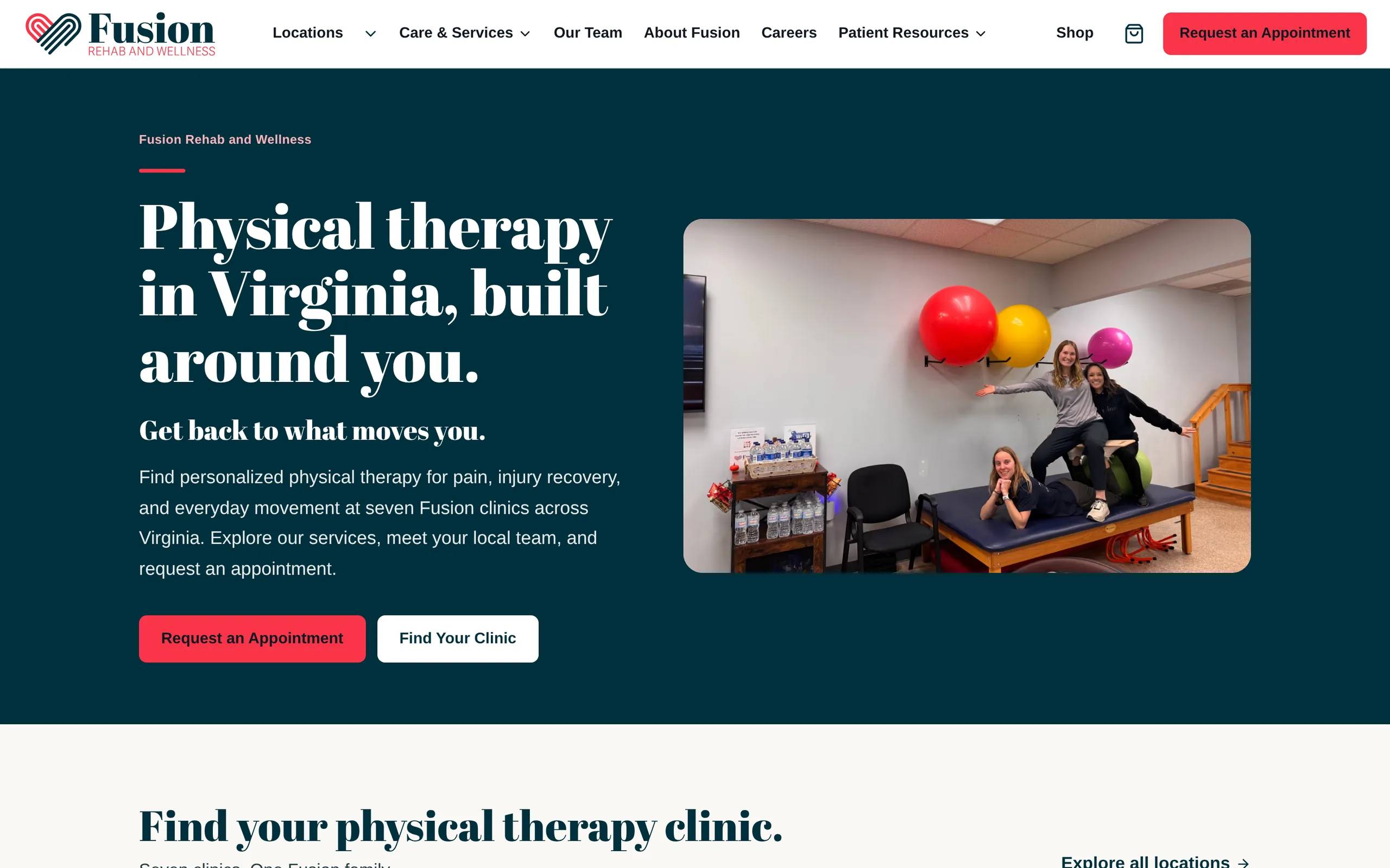
For Fusion Rehab & Wellness, the homepage identifies physical therapy and Virginia immediately. It offers an appointment request and a route to find a clinic.
That fits the decision a patient is making: which location is nearby, who works there, and how to request care. Fusion's own team photography supports that choice. Dedicated clinic pages carry the practical details.
The lesson for a service business with several locations is to make geography part of the customer's path. Give the homepage a clear route into the right location, then let that page supply its address, hours, team and contact options.
- 1
Service and area. The headline names the service and the state: “Physical therapy in Virginia, built around you.” The paragraph below it mentions seven clinics across Virginia.
- 2
Appointment action. Request an Appointment is the coral button under that paragraph, and the same request sits at the right end of the header.
- 3
Clinic-finding route. Find Your Clinic sits beside it, and the next section, headed “Find your physical therapy clinic,” links to each clinic's own page.
Example 2: Hussarian separates two kinds of inquiry
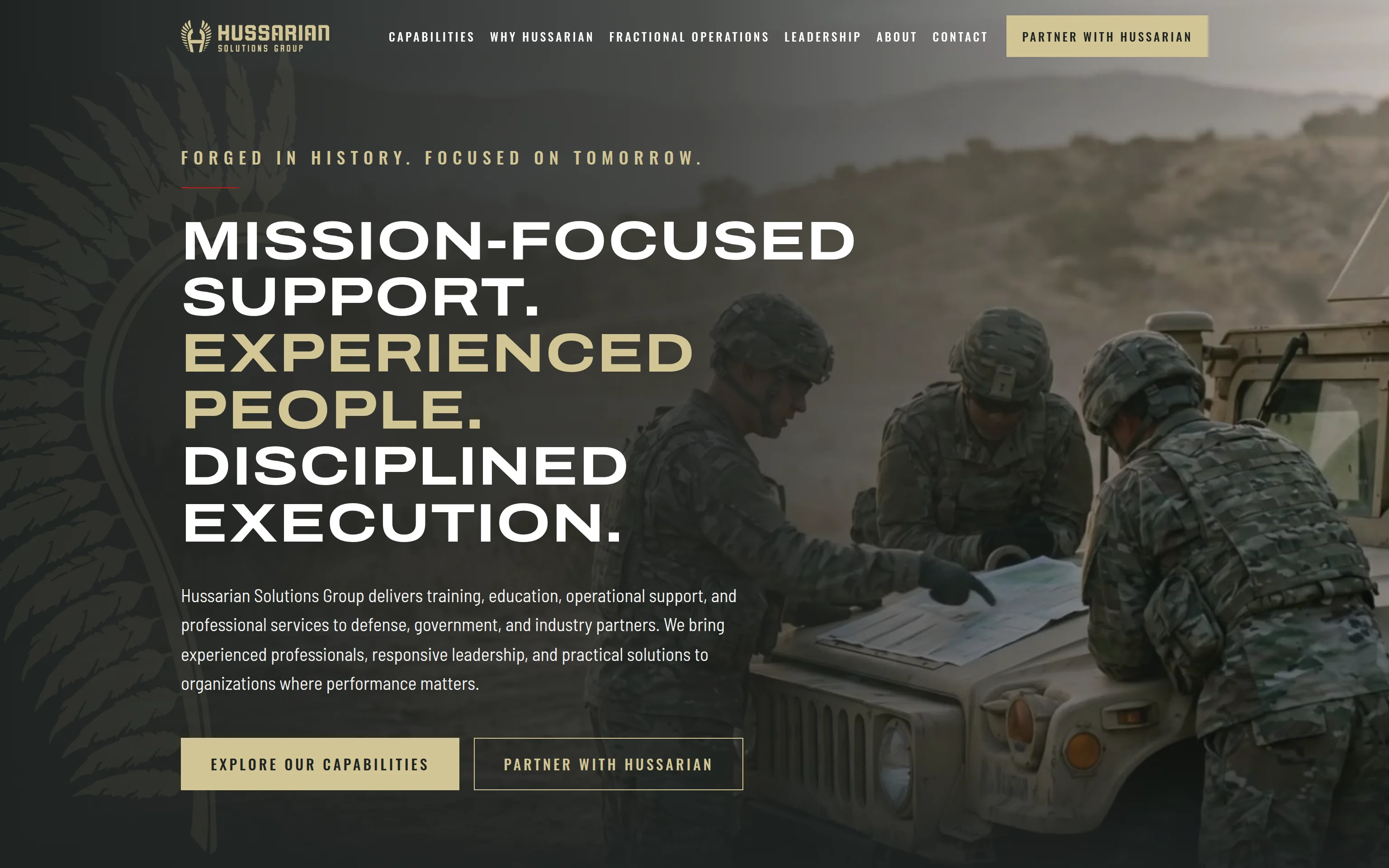
Hussarian Solutions Group serves government and industry readers as well as growing contractors looking for fractional operations support.
Its page establishes the federal capabilities first, then gives the commercial offer its own section. Section-specific calls to action lead into one inquiry form with the relevant path selected.
For a business with different buyer groups, this suggests a useful approach: explain the paths in a deliberate order and carry the visitor's choice into the contact process. A person asking about one service should not have to decode a form intended for another.
- 1
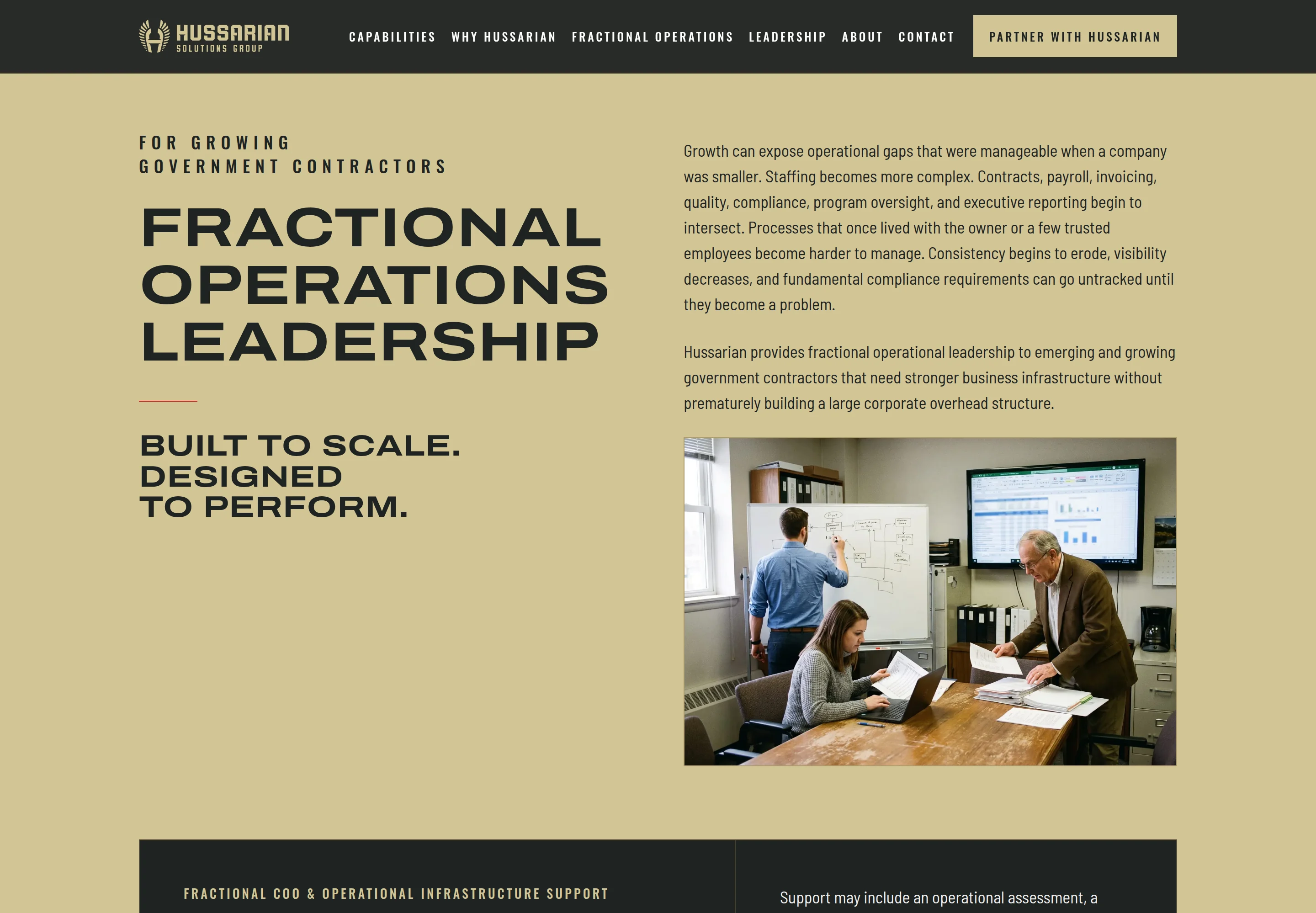
The audience, named first. The label over the heading says who the offer is for: “For growing government contractors.”
- 2
A section of its own. Fractional operations leadership sits on the brand's sand field. The federal sections above it are set on charcoal, in the same type.
- 3
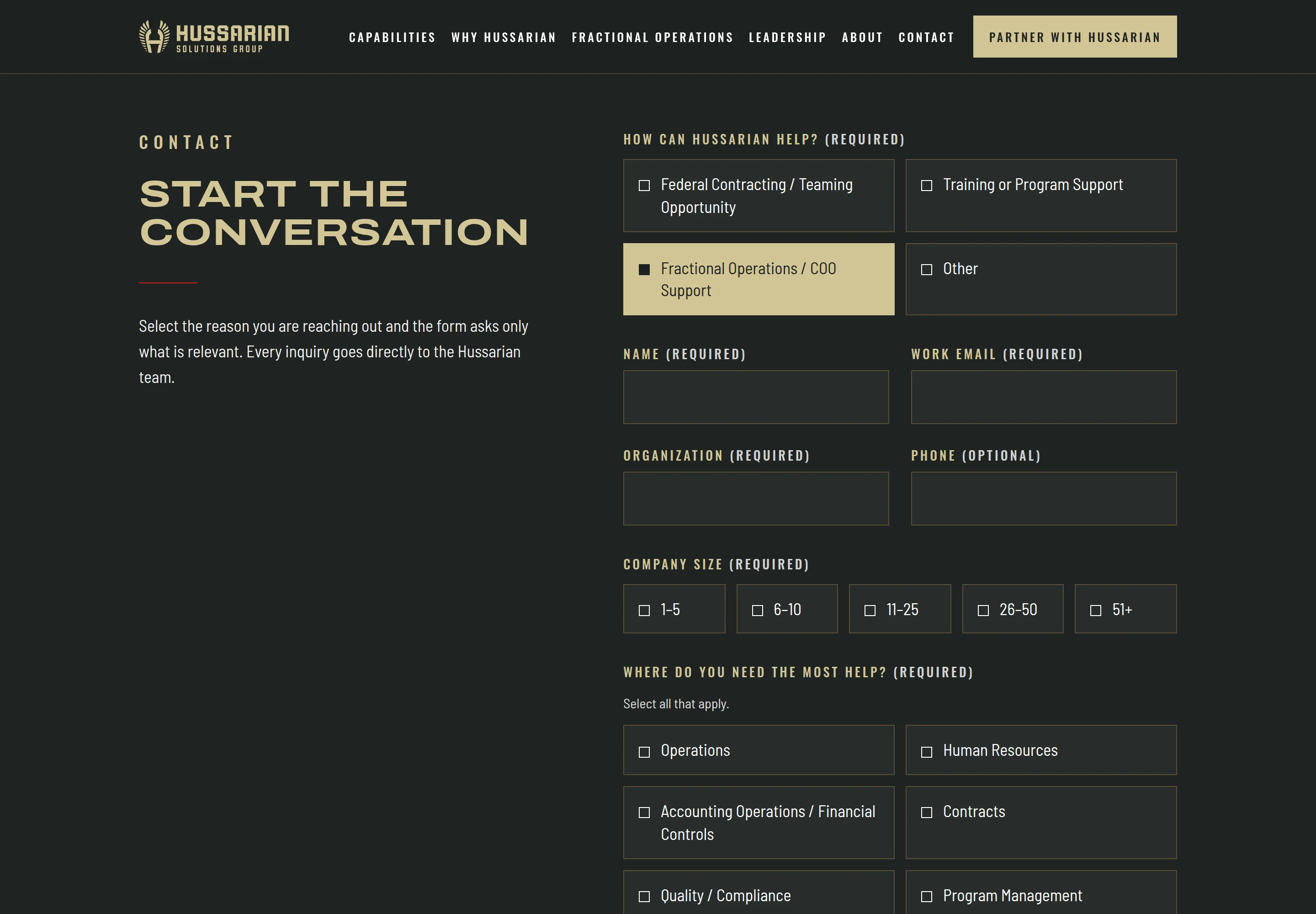
The path, already chosen. The section's own button opens the form with Fractional Operations / COO Support selected.
- 4
Questions for that path. Company size and the areas where help is needed follow. A teaming inquiry is asked about the opportunity instead.
Put proof beside the question it answers
Proof works best when the reader can connect it to a specific decision.
A project example can show the type of work you handle. A team profile can explain relevant experience. An accurate testimonial can describe what working with you was like. A current credential can answer a qualification question.
Use the evidence your business actually has, and explain its relevance. A project image benefits from a short caption describing the service and your role. A testimonial needs permission and accurate attribution. A credential needs enough context to make clear what it covers.
If you are starting out, explain your process and show relevant work honestly. Label sample work as sample work. An invented review or unverified result has no place on the page.
Show enough service detail to help someone choose
Service names alone can leave visitors guessing. Add a sentence about the problem each service addresses and what the customer receives.
Keep the homepage summary short enough to compare. Link to a dedicated page when the service needs scope, examples, eligibility details or its own questions answered.
A business offering three services does not automatically need three equal-size cards. If one service is the main reason people visit, it can lead. If customers arrive with different needs, label those routes in their language.
The same principle applies to pricing. A straightforward fixed offer may benefit from a visible price. A custom service may need an explanation of scope and the information required for an estimate. Publish the details you can stand behind.
Explain what happens after the click
A button creates an expectation. The destination needs to fulfill it.
If a visitor is requesting an appointment, explain whether the request confirms a time or whether the team will follow up. If the action starts a project inquiry, briefly describe what information you need and what happens next. Only promise a response time the business can meet.
Keep the first form focused on the information needed for that step. Detailed discovery can follow when the project requires it.
On a phone, check the entire journey: opening explanation, service choice, proof, button, form and confirmation. Readable text and a working form matter just as much as the opening layout.
Review your homepage with this short exercise
Open your homepage and answer these questions using only what is visible on the page:
- What service does the business provide, and for whom?
- Can someone tell whether the location or service area fits?
- Which piece of evidence supports the decision to contact you?
- What is the main next step, and where does it lead?
- Does the destination explain what happens after submission?
Ask someone unfamiliar with the business to do the same exercise. Their answers can show you which explanation needs attention.
Write down the smallest useful change first. You might need a clearer opening sentence, a relevant project example, a better location link or a more specific button label. A longer homepage is not automatically a more useful one.
Common homepage questions
Does every service need to be explained on the homepage?
Give visitors enough information to choose a route. Use dedicated service pages for substantial detail, and keep the homepage focused on orientation and the next decision.
Should a homepage have only one button?
It can have several buttons, including repeated access to the main action. Make one action visually prominent for the primary audience and distinguish any secondary path. Avoid a row of competing actions with unclear purposes.
Is this the same as planning a website redesign?
This guide focuses on what the homepage says and how it guides visitors. A full redesign also needs decisions about existing pages, content migration, redirects and launch testing. Use our small-business website redesign checklist for that planning.
See a direction for your own homepage
If you want to explore how these decisions could work for your business, VAHZOR offers a $199 homepage preview: a private clickable design with desktop and mobile layouts and one round of revisions.
The preview is a design proposal; a production website build is agreed separately. If you continue with the full build, the $199 is credited toward it. See the offer page for the current scope and terms.